echarts 柱子包含关系
<div id="zy" style="width: 100%; height: 900px;"></div>
<script type="text/javascript">
// 基于准备好的dom,初始化echarts实例
var myChart = echarts.init(document.getElementById('zy'));
// 指定图表的配置项和数据
option = {
tooltip: {
trigger: 'axis',
axisPointer: { // 坐标轴指示器,坐标轴触发有效
type: 'shadow' // 默认为直线,可选为:'line' | 'shadow'
}
},
color: ['#f4892a', '#22ac38'],
grid: {
x: 140,
y: 20,
x2: 20,
borderWidth: 1
},
xAxis: {
type: 'value',
splitLine: {
show: true,
lineStyle: {
color: '#1e2b43'
}
},
axisLabel: {
textStyle: {
color: "#fff"
},
alignWithLabel: true,
interval: 0
}
},
yAxis: {
type: 'category',
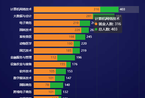
data: ['森林生态旅游与康养','食品智能加工技术','商务数据分析与应用','旅游管理','人工智能技术应用','工业机器人技术','园林工程技术','物联网应用技术','环境工程技术','绿色食品生产技术','电气自动化技术','食品质量与安全','水利工程','连锁经营与管理','种子生产与经营','宠物养护与驯导','市场营销','跨境电子商务','国际商务','数字媒体技术','软件技术','设施农业与装备','金融服务与管理','园艺技术','动物医学','畜牧兽医','园林技术','电子商务','大数据与会计','计算机网络技术',],
axisLabel: {
textStyle: {
color: "#fff"
},
alignWithLabel: true,
interval: 0
}
},
series: [
{
name: '就业人数',
type: 'bar',
zlevel: 2,
emphasis: {
focus: 'series'
},
barGap: "-100%",//实现两个数据在一个柱子上面显示
label: {
normal: {
show: true,
position: 'insideRight',
textStyle: {
color: '#333'
}
}
},
data: [30,30,72,78,69,59,76,72,45,56,59,70,56,88,94,101,118,101,78,101,105,155,112,185,190,198,226,219,281,316,],
},
{
name: '总人数',
type: 'bar',
zlevel: 1,
barGap: "-100%",//实现两个数据在一个柱子上面显示
emphasis: {
focus: 'series'
},
label: {
normal: {
show: true,
position: 'right',
textStyle: {
color: '#fff'
},
formatter: '{c}',
}
},
data: [41,44,86,89,90,92,94,94,95,97,97,99,99,102,108,113,131,132,140,147,153,176,196,219,220,245,262,268,384,403,],
}
]
};
// 使用刚指定的配置项和数据显示图表。
myChart.setOption(option);
</script>常用的堆叠图
<div id="maingzqtj" style="width: 100%; height:305px; "></div>
<script type="text/javascript">
// 基于准备好的dom,初始化echarts实例
var myChart = echarts.init(document.getElementById('maingzqtj'), 'macarons');
option = {
tooltip: {
trigger: 'axis',
axisPointer: {
type: 'shadow'
}
},
grid: {
x: 50,
y: 40,
x2: 15,
y2: 50,
borderWidth: 0
},
xAxis: [
{
splitLine: {
show: false
}, //去除网格线
splitArea: {
show: false
}, //去除网格区域
type: 'category',
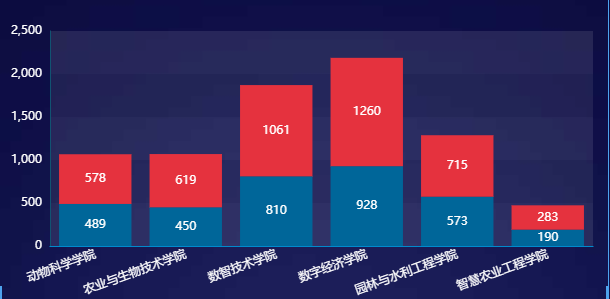
data: ['动物科学学院','农业与生物技术学院','数智技术学院','数字经济学院','园林与水利工程学院','智慧农业工程学院',],
splitLine: {
show: false,
},
axisTick: {
show: false
},
axisLabel: {
textStyle: {
color: "#fff"
},
alignWithLabel: true,
rotate: 20
}
}
],
yAxis:
{
type: 'value',
nameTextStyle: {
color: '#fff'
},
splitLine: {
show: false,
lineStyle: {
color: '#23303f'
}
}, splitArea: {
show: true
}, //去除网格区域
axisLine: {
show: true,
lineStyle: {
color: '#115372'
}
},
axisTick: {
show: false
},
axisLabel: {
textStyle: {
color: "#fff"
},
alignWithLabel: true,
interval: 0
}
},
series: [
{
name: '就业人数',
type: 'bar',
stack: "total",
color:"#006699",
label: {
normal: {
show: true,
formatter: '{c}',
}
},
data: [489,450,810,928,573,190,]
},
{
name: '毕业人数',
type: 'bar',
stack: "total",
color: "#e5323e",
label: {
normal: {
show: true,
formatter: '{c}',
}
},
data: [578,619,1061,1260,715,283,]
},
]
};
myChart.setOption(option);
</script>